Comflow Styling Basics
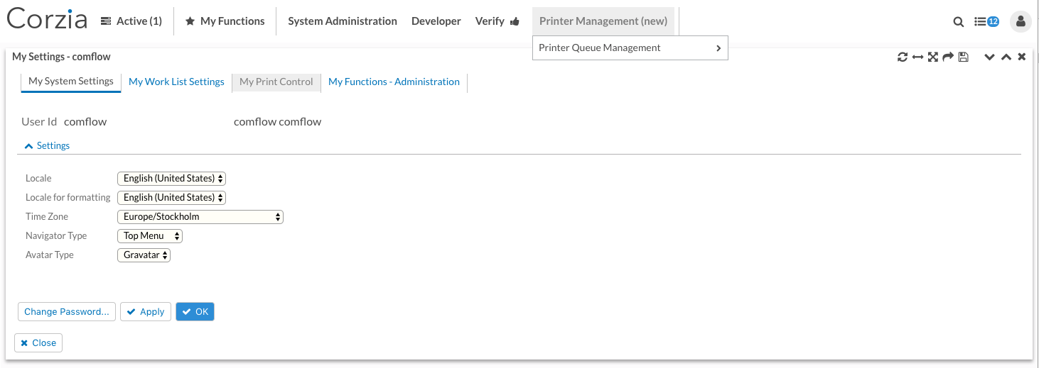
The general styling of Comflow has been worked on a little for this release. We've had an ambition to be even more data focused in our presentation and make other, less important parts, harmonize more with the background.
In the Comflow standard skin we have:
- Made the text of most clickable portlet content parts blue, such as tab items, buttons and segment headers.
- Made those parts hover colors gray.
- Made top and mega menu items and portlet menu options the same gray hover colors as in bullet 2.
- Moved portlet toolbar actions to the upper right part of the portlet title bar so they will always show.
- Made all input fields background color light yellow, yet in order to focus on data.
- Decided to generate a css class name on every button that has a function key associated with it. This enables you to decide a certain style for a certain function key and this style is applied on all those buttons throughout the entire portal. In this case, the OK button has the
Enterkey associated with it and we've decided to make the text color white and the background color blue. This is a way to draw attention to more important actions in a general manner. The specific css class is prefixed withbutton-fk-and followed by the function key name which, in this example, will make up the classbutton-fk-Enter. This class is by default bundled with the comflow.css file. Put this class in your Custom.css file to override it and change style as you wish. Don't forget to put a prefixing dot in the beginning of the class name (.button-fk-Enter {...})
Comflow Portlet